Whenever I’ve got some free time at home, one of my creature comforts is to throw on my wizard-print bathrobe, pop a squat in my favorite corner of the aged 1940s house I’m currently renting, and check in on any recent noteworthy rebrands.
Under Consideration’s Brand New is a great site to visit to discover these rebrands (remember when Animal Planet did… that?) and see how design and marketing professionals feel about them. I’ve been subscribed since they switched to a paid model, and two George Washintgons a month is a price I recommend paying for such a lovely curated list of rebranding dos and don’ts. Looking at what has and hasn’t worked for larger widely recognized brands can provide valuable insight that you can apply when it starts to feel like it’s time to throw on a new coat of paint.
Let’s dive into some of the better rebrands of the last few years — some in-house, and some from the best digital marketing agencies around — and see what we can take away from them.
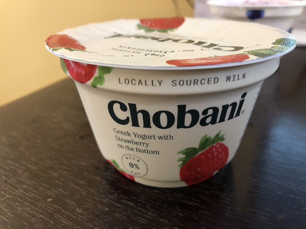
Chobani
Greek yogurt is about as polarizing as pineapple on pizza (I’m on team “yes,” but you do you), but Chobani’s 2017 rebrand was a refreshing reimagining of the United States’ favorite strained yogurt brand.
After ten or so years in the market and with a sizable lead over their competition, Chobani decided the best time to overhaul their presentation was while they were ahead. In collaboration with Commercial Type, Berton Hasebe drew the new logo and designed the new typefaces that represent the Chobani brand across product lines. Moving away from the old geometric wordmark inspired by classic Greek lettering, Hasebe created what I would consider the perfect wordmark. It’s chunky yet smooth. The fresh but familiar curves feel like this has been the real logo all along — like it was meant to be. Paired with their overhauled primary color scheme of deep green and beige with a concentrated focus on imagery of fresh fruits and colorful, abstract shapes, their products pop off the shelves in dairy aisles where it was starting to feel a little like every brand was doing the same thing.
I don’t even like Greek yogurt but I won’t pretend like I don’t think about grabbing a pack nearly every time I’m at the store simply because it looks so good.
Warner Brothers
It’s no simple task to take an iconic brand whose appearance has remained mostly unchanged for nearly 70 years and make it feel fresh and new, but Warner Bros. accepted the challenge and ran with it.
The film giant’s new logo isn’t a huge shift;it retains the same recognizable shape and lettering they’ve identified with since 1929, but simplifies it into a comfortable evolution. It’s a good logo, and the choice to fully commit to the blue is commendable. But the real wins are with how they’ve chosen to apply their new branding. The simplification of classic shield provides ample opportunity to tweak it to match the media in which it’s located. Their custom typeface pulls in from the logo without going overboard, feeling retro enough while remaining modern. This is a great take on bringing a classic brand into the modern era.
I think lately people have been leaning a little too heavily on the “make it flat” trend we’ve been seeing but, I don’t know, Warner Bros. is pulling it off.
American Express
“What??” you’re saying, “All they did was remove the gradient!” You’re kind of right, but look a little closer and you’ll see that they switched the typeface up, cleaned it up, AND removed the gradient. Notice the sharper terminals on the ‘S’s and ‘R’s, the decision to split the ‘C’ and the ‘A,’ and the tighter stroke around the lettering.
On top of tweaking their logo, they gave attention to many of their identity elements. This included logo variations and bringing their centurion mark up to date with cleaner lines and simplified details, all while making sure the logo stands out on darker backgrounds to make it easier to implement across all marketing materials. These small changes add up to make a big impact, especially on big, omnipresent brands. These mammoth names (i.e. Apple, American Express, Amazon) have to consider how a brand “update” will be perceived by the public and recognized after having their old logo splashed quite literally everywhere.
Why Rebrand?
Much like that loaf of fancy bread you bought a few days ago that’s currently metamorphosing into a $7 paper weight on your kitchen counter, brands go stale after a while. Depending on the industry and its corresponding product or service, some brands can last a whole lot longer on the shelf than others. But everyone’s time comes.
If it’s starting to feel like your time has come, either on your own volition or if Gen Z has started making fun of you on Tik Tok, consider reaching out to On Target. Our digital marketing agency will do the research, consider your options, and come up with an optimal strategy for you and your brand to go from weird, hyper-sexual ‘00s GoDaddy to modern and reputable ‘20s GoDaddy.
A very important addendum: In the spirit of incredible rebrands, we must also consider incredible rebrand documentation. It is extremely important that you read Pepsi’s 2008 logo redesign document on rebrands whenever you have a spare moment in your day. It won’t take you very long, and I promise it is worth every second you will spend on it.