
From the guy who brought you The Best Rebrands We’ve Seen way back in April of 2021 comes the hotly anticipated sequel you’ve all been waiting for: The Worst Rebrands We’ve Seen.
In this thrilling Part 2, the digital marketing team at On Target will go over some of the absolute worst rebrands that have migrated and grazed their way through the rolling hills and amber fields of the Great Marketing Plains, offending each and every one of our delicate sensibilities along the way. As you read through this list, it is my hope that you can take some of these as (major) counter-examples on how to rebrand gracefully and successfully if you see yourself or your brand approaching that milestone in the near future.
So without further ado, I present to you The Best Rebrands We’ve Seen 2: The Worst Rebrands We’ve Seen.
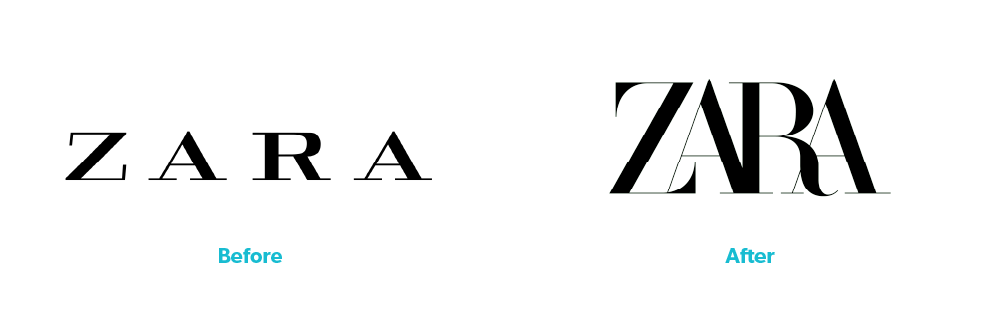
ZARA
If you don’t have a penchant for Forever21-adjacent fast fashion retailers, you might have missed Spanish fast fashion retailer ZARA’s controversial rebrand back in the beginning of 2019. If you’re one of the unlucky ones whom this haunts on the daily, I’m sorry for adding today to the streak. (But you’re the one that clicked this article – did you think this wasn’t gonna make it on the list?).
There’s something special about the claustrophobia that these four letters can invoke on sight. Sure, it’s still legible, but only just. What was once an easy-to-read wordmark that had the spacing to suggest they were punching above their weight accidentally got dropped into a trash compactor only to be removed right before it was too late. Logo designers will go on for hours about the importance of manually kerning (adjusting the spacing between individual characters) type, and I’m inclined to agree. This is perhaps a lesson in not getting carried away when doing that.
You’ve got to give it to them though. Unlike the next item on this list they stuck to their guns and haven’t switched back yet, almost four years later. Hats off to you, ZARA.
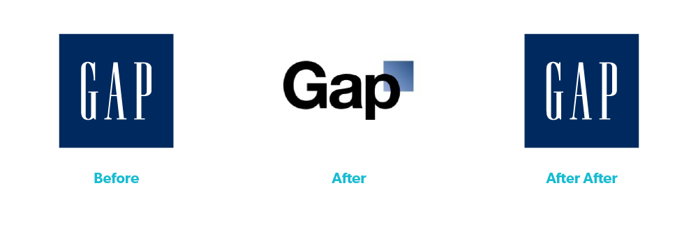
Gap
Clothing companies certainly seem to have a propensity for taking something that’s working just fine — or even succeeding — and suplexing it for funsies.
“What do the kids like these days? Helvetica? Great; here’s one hundred million dollars” seems like it’s exactly how the conversation between Gap and their digital marketing agency went. Why you would take a logo that’s timeless and instantly recognizable, albeit a little dull, and suck all of the life out of it for the sake of modernization is truly beyond me. Don’t get me wrong, I’m a fan of modern and simple, but if the current iteration of your logo has been around for thirty years, and you’re already a household name, consider just leaving it be.
One might argue that they were trying to take advantage of the “all press is good press” mentality to generate some good old fashioned hate clicks, but one would be wrong, because they switched back to their previous logo after only 6 days with the new one.
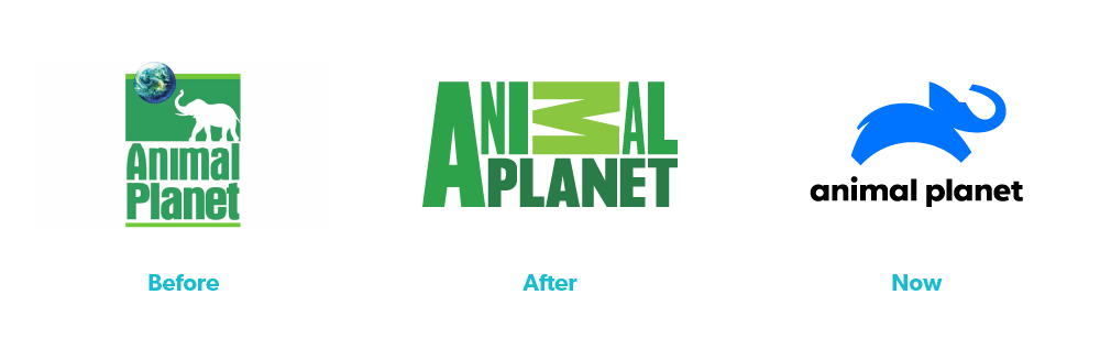
Animal Planet
If you’re anything like I was back in the early to mid-2000s, if the TV was on, there’s a good chance it was tuned to Animal Planet, and that little white elephant silhouette in the green box with the Earth rotating above it was a profound source of nightly comfort. (‘The Crocodile Hunter’ anyone? ‘The Most Extreme’ anyone?) If you’re anything like I was in 2008, when they revealed the abomination that was.. well whatever that is, there’s a good chance you thought it was some sort of an early April Fool’s joke.
It wasn’t. Despite poor legibility, they stuck with this cronenberg — with its inconsistent character widths, heights, colors and rotations — for an entire decade. This came at the same time they switched to decidedly more human-centric programming, which might have been as big of a turn off as this rebrand was. If this is your first time really paying close attention to this logo, you might be looking to see if you can find an animal represented by the letters. I’m here to let you know that you can’t. There isn’t one. Why is the ‘M’ sideways? Why not? Why are the ‘N’ and second ‘A’ so skinny? Because they can be.
If it weren’t for how truly awful the 2008-2018 iteration of Animal Planet was, the 2018 rebrand probably would have come as a disappointment as well. But much like how your parents loved your milquetoast second significant other because of how much of a disrespectful dumpster-fire your first was, we all accepted the 2018 rebrand excitedly and with open arms.
Rebranding the right way
Last time, we compared aging logos to fancy loaves of bread; spectacular on the date of purchase, but moldy paperweights as they approached their end. When considering a rebrand, it’s important to take the time to think about what you’re trying to accomplish. Brutally honest questions to ask yourself:
- Are you rebranding just for the sake of it?
- Because there’s a little more leftover in the marketing budget than you thought, and October first is rapidly approaching?
- Or do you have a fantastic design vision backed by solid research and reasoning to take your brand to the next level?
Whether you find yourself in a rebrand no one asked for or one that’s desperately overdue, you don’t have to create a new logo in a vacuum. (That’s how these monstrosities came to be.) We can help. The digital marketing team at On Target will assist you every step of the way with market and audience research, design expertise, and strategy development to get the ball rolling and take your ancient identity into the modern age. Give us a call today at (407) 830-4550 or fill out our contact form to get in touch with the team and turn your vision into a reality.